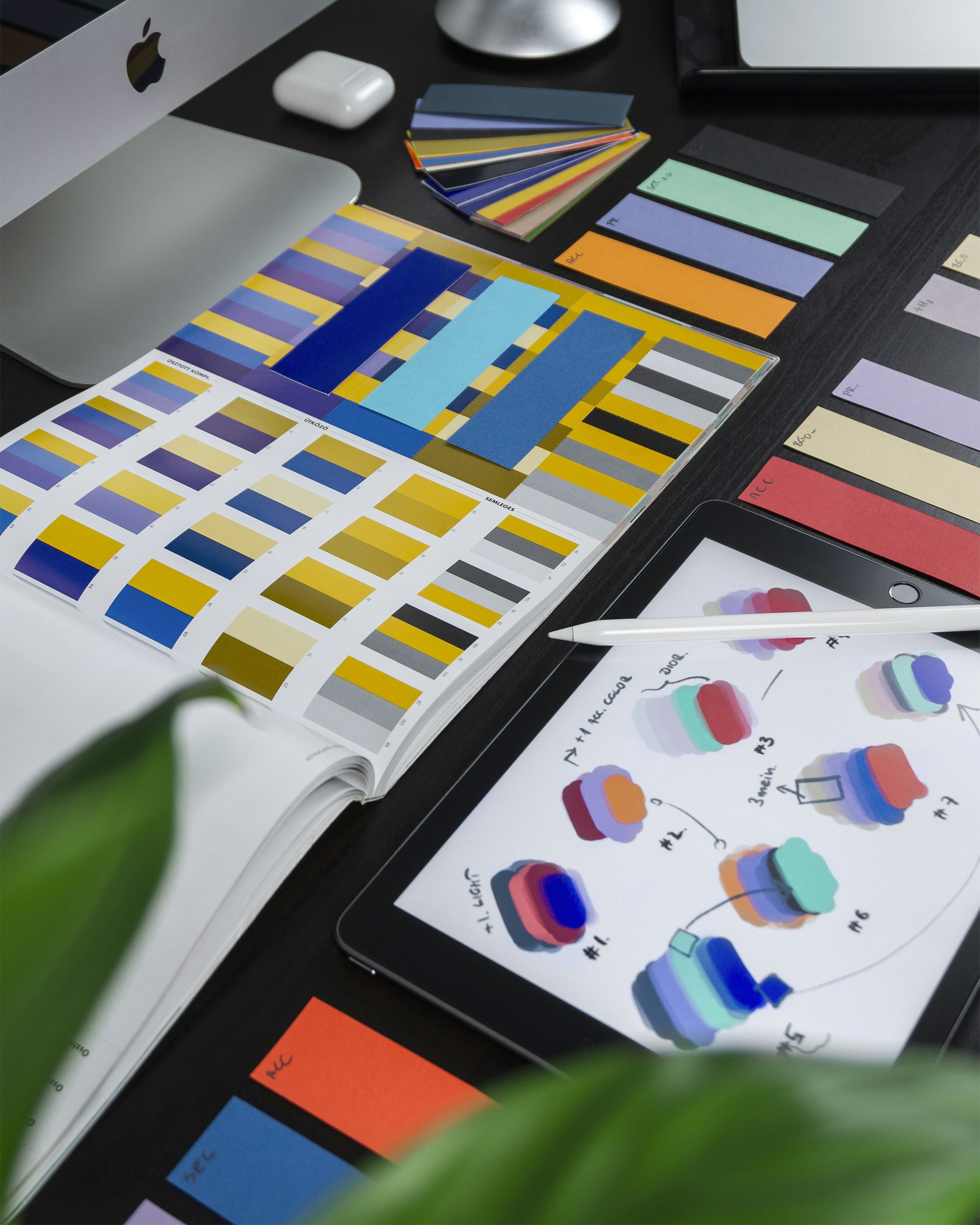
You know the look you want. You have seen it somewhere: a landing page that felt expensive, a dashboard that was actually readable, a magazine spread with type that stopped you scrolling. The problem is not taste. The problem is describing it. You type “clean and modern,” the AI hands you the same soft gray page it hands everyone, and you are back to guessing which adjective unlocks the thing in your head.
There is a faster path. Stop describing the design and show it. Every major AI model now reads images, so you can prompt AI with reference images: paste a screenshot of a page you admire, tell the model what to borrow and what to leave behind, and it builds something in that spirit using your content. Words get you close. A picture pins it.
TL;DR
Attach a screenshot of a design you like, then write a prompt that says three things: what to borrow (layout, type scale, spacing, accent), what to ignore (their colors, their copy, their brand), and your own content. Ask for one self-contained HTML file. The model reads the structure right off the image and matches the feel far better than adjectives can. Take inspiration, not assets, and iterate against the reference until it clicks.
Why do words alone hit a ceiling?
Language is a low-bandwidth way to move a picture from your head into a model’s. “Editorial, warm, generous spacing” is genuinely useful direction, and if you have not built a vocabulary for it yet, our guide to feel-words that art-direct AI output is the place to start. But there is a limit. You can feel that a layout is right without being able to name why: the exact ratio of headline to body, the way the nav sits, how much air surrounds the hero, the particular restraint in the color.
A reference image carries all of that at once. The model does not have to reconstruct your intent from eight adjectives and guess at the rest. It can see the proportions, the hierarchy, the density, and the mood in a single glance, the same way you did.
What counts as a reference?
A reference is anything visual that shows the model where you are headed. You have more of them lying around than you think.
- A screenshot of a real page whose layout or type you admire. The most common and most powerful.
- A design shot from Dribbble, Behance, or a portfolio, where someone already solved the look you want.
- Your own sketch, even a photo of a whiteboard or a napkin. Boxes and arrows are enough to communicate structure.
- A competitor or peer’s page, when you want to sit in the same category but stand apart.
- A single element: one pricing table, one nav bar, one chart, one hero section you want echoed.
- A mood or physical object, a book cover, a product package, a poster, when you are chasing a feeling more than a layout.
You are not asking the model to trace any of these. You are giving it a direction it can see, then steering.
How do you actually do it in Claude, ChatGPT, or Gemini?
All three read images. The mechanics are almost identical.
| Model | How to attach | Notes |
|---|---|---|
| Claude | Drag the image into the chat, or click the paperclip | Strong at reading layout structure and returning one clean HTML file |
| ChatGPT | Click the image icon, or paste from clipboard | Works well; Canvas is handy for iterating on the result in place |
| Gemini | Use the image upload button next to the prompt box | Reads screenshots reliably; good for quick style matching |
Take the screenshot at a decent resolution. A crisp, full-width capture reads far better than a tiny blurry crop. If the reference is a long page, grab the section that matters most rather than a squashed full-page thumbnail.
The prompt formula: borrow, ignore, replace
A reference without instructions is a coin flip. The model does not know whether you love the layout, the color, or the vibe of the copy, so it might copy the wrong thing. Say it plainly. Every strong image prompt names three things.
- Borrow: the qualities you want carried over. Be specific. “The two-column layout, the oversized serif headline, the generous whitespace, the single warm accent.”
- Ignore: what to drop. “Do not use their colors, their logo, their photos, or their copy.”
- Replace: your actual content. Give it your headline, your sections, your data.
Here is the pattern as a copy-paste prompt. Attach your screenshot, then paste this underneath and fill in the brackets.
I've attached a screenshot of a page I like as a design reference.

Build me a single self-contained HTML page in the same spirit.

BORROW from the reference:
- the overall layout and section order
- the type hierarchy and relative sizes (big headline, small labels)
- the amount of whitespace and the density
- the general structure of the hero and the call to action

IGNORE from the reference:
- its colors: use my palette instead: [your colors, or "a warm neutral base with one accent"]
- its logo, images, and copy: none of that should appear

CONTENT is mine:
- Headline: [your headline]
- Sections: [list your sections in order]
- Call to action: [your button text and where it links]

Output the complete HTML with all CSS and JavaScript inlined into one file,
no external dependencies. Make it responsive.
For matching just one element, narrow it:
Attached is a pricing section I want to match. Rebuild it as a self-contained
HTML component with the same three-column layout, the same card styling and
spacing, and the same "most popular" highlight treatment. Use my plans and
prices below and my brand color [#hex] instead of theirs. Keep it responsive.

[paste your plans and prices]
What to borrow vs what to leave behind
The instinct is to grab everything. Resist it. A page that clones a reference wholesale looks like a knockoff and, if the reference belongs to a real brand, is a problem. The skill is knowing which layers travel and which do not.
| Layer | Usually safe to borrow | Keep as your own |
|---|---|---|
| Layout | Structure, grid, section order, proportions | nothing here, borrow it |
| Type | Hierarchy, relative scale, serif-vs-sans choice | The exact brand typeface if it is proprietary |
| Spacing | Density, rhythm, how much air things get | nothing here, borrow it |
| Color | The temperature and contrast approach | The exact brand palette and accent |
| Content | nothing, this is all yours | Every word, image, logo, and data point |
| Identity | nothing, this is all yours | Logo, name, photography, voice |
The clean line: take inspiration, not assets. Studying how a page is built and asking AI to work in that spirit is ordinary design practice. Lifting a company’s logo, photography, copy, or exact brand identity is not. Borrow the bones and the feel, bring your own everything-else, and you stay comfortably on the right side of it.
Combine the image with a few words
A reference shows structure and color, but it cannot show everything. It says nothing about how the page moves, how the copy sounds, or how it behaves on a phone. That is where a handful of words finishes the job. Attach the image, then add the qualities the picture cannot carry.
Match the attached reference for layout and type. Then: make it feel calm and
editorial, add a subtle fade-in as sections scroll into view, keep the copy
plain and confident, and make sure it collapses cleanly to a single column on
mobile.
This is the sweet spot. The image handles the “what it looks like,” the words handle the “how it feels and behaves.” If you want to go deeper on the words half, briefing AI like you would brief a designer covers how to structure that side of the request.
Common pitfalls
- Asking for a pixel-perfect clone. The model is not a tracing tool, and you do not want a copy anyway. Aim for the spirit, then steer.
- A tiny, blurry screenshot. If you can barely read it, neither can the model. Capture it clean and reasonably large.
- Saying nothing about what to ignore. Silence is how their teal accent ends up on your page. Name what to drop.
- Referencing five pages at once. One strong reference beats a collage. If you must combine, say which one governs layout and which governs color.
- Forgetting your content. An image plus “make me a page” gives you a beautiful shell full of their words. Always supply your own.
Iterate against the reference
The first result gets you most of the way. Now put your page and the reference side by side and correct the gap in plain language, the same as you would with a designer.
“The headline is too small next to the reference, push it larger. The spacing between sections is tighter than the reference, open it up. The accent is too loud, mute it one step.”
Each pass closes the distance. Comparing on a real screen matters here, because a page never looks the same shrunk into a chat window as it does full-width in a browser. That is the last step, and it is worth doing on the actual thing.
Get it on a real screen to compare
To judge whether your page matches the reference, you have to see it the way a visitor would: full-width, live, with the hover states and the scroll animation working. A screenshot of your own page will not tell you, and neither will a preview pane.
Publish it as a live link. Ask the AI for one self-contained HTML file, or a ZIP if the project spans several files, then drop it into VisiblePage. You paste the HTML or drop the ZIP and get a real URL in seconds, served fast from the edge, with every layout detail, hover, and animation intact because you are sharing the actual page and not a picture of it. Open it next to your reference on a full screen and the gaps are obvious. Better still, that link is one canonical URL: as you iterate on the design, you republish and the same link updates, so anyone you are showing it to always sees the current version. Make it public, private, or password-protected while you refine, and point your own domain at it when it is ready.
Try it now: Publish your AI-generated HTML with VisiblePage and get a live link in seconds.
Frequently asked questions
Can I really prompt AI with a screenshot to match a design? Yes. Claude, ChatGPT, and Gemini all accept images. Paste a screenshot into the chat and the model reads its layout, type, spacing, and color, then builds a page in that spirit using your content. It will not clone the reference pixel for pixel, and you should not want it to, but it gets the feel far closer than words alone.
Is it legal to use someone else’s site as a reference? Take inspiration, not assets. Studying a layout, a type scale, or a color mood and asking AI to build something in that spirit is normal design practice. Copying a company’s exact logo, photography, copy, or brand identity is not. Borrow the structure and the feel, bring your own content and identity.
Which is better, describing the design in words or showing an image? Both together. Words like editorial or high-contrast set the direction, and a reference image pins the specifics you cannot easily name. Attach the picture, then add two or three feel-words for the qualities the image does not show, like the motion or the tone of the copy.
The AI copied my reference too literally. How do I fix that? Tell it what to ignore. Say use this only for the layout and spacing, not the colors, or match the type hierarchy but use my palette. Being explicit about what to borrow and what to drop is the whole skill. A reference is a starting point you steer away from, not a target to hit exactly.
How do I share the page the AI built from my reference? Ask for one self-contained HTML file, then publish it to a host that gives you a live URL. With VisiblePage you paste the HTML or drop a ZIP and get a shareable link in seconds, with every layout, hover, and animation intact so you can compare it to your reference on a real screen.